


Maximize Event Ticket Sales By Learning Where to Put Your CTAs
Calls to action (CTAs) can be a powerful tool to use throughout your marketing. Over 90% of visitors that read your headline will also read and see your CTA copy.
But first, where to put it?
Figuring out where to put your CTA is also an important part of your marketing strategy.
Top 5 places for CTA buttons to lives
1. On a pop-up landing page
The CTA should be front and center on your landing page. Marketers use their landing page as a call to action on its own.
The idea of a landing page should be to capture the attention of your visitor with a relevant and punchy headline they can’t ignore followed by a CTA or form.
These pages are single web pages that are specifically used to obtain certain marketing goals; drive traffic, act as a lead magnet, gain leads, etc.
Here's an example of a landing page; clean, simple, and tells the viewer exactly what to do.
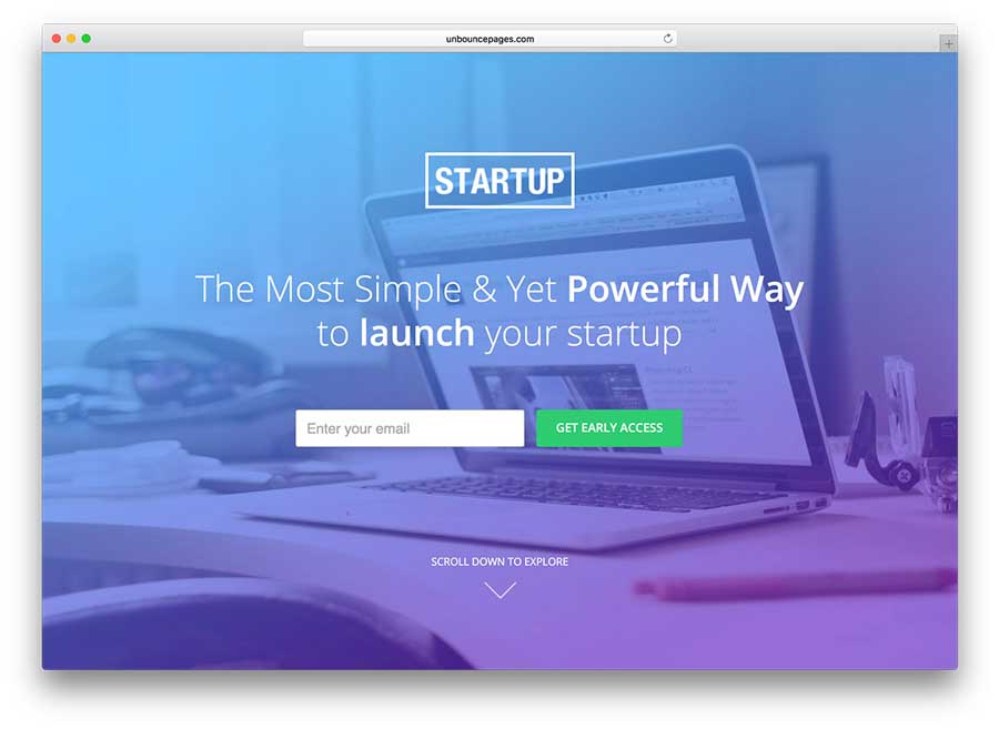
Landing pages should be easy to use, incorporating one call to action that presents a single offer; in this case that offer would be to “Purchase Tickets”.
The goal is to create a user-friendly design that is straight-forward, to the point, and compelling enough that they click your CTA.
Tips for creating your landing page:
- Create a sense of urgency through your headlines and CTAs. “Tickets are almost gone”, “One-day sale”, “Limited time offer”, etc.
- Create a compelling headline that will capture the readers attention.
- Make using your landing page easy and use a minimalist approach when designing it. Less it more!
- Add images and videos that showcase your event. This is a fast way to tell people about your event without using a lot of extra text and creating an overwhelming space.
Popular softwares used for creating landing pages:
2. After or in a blog post
When a reader reaches the end of your blog post, you don’t want them to click away and move on.
Content such as blogs can have an average of a 50% bounce rate, which makes a CTA even more important for capturing a lead.
The blog post about your event should have a CTA where users can purchase tickets or lead them to related posts so users will stick around and spend more time learning about your event.
You took the time to get them to that blog or article.
Why let them go?
Incorporating CTA throughout and at the end of your blog is crucial for capturing leads and simplifying the process of purchasing tickets.
3. Front and center on the homepage
A CTA should definitely be on your homepage.
You can even have multiple CTAs on your homepage since your website is the corridor to the rest of your information. Here are some examples of homepages that made purchasing tickets easy with the use of a call-to-action.
4. Social media bio (Linktree)
Adding a CTA to your social media can be important, especially on a platform such as Instagram, where more people are likely to see your bio or refer to it for more information.
Adding a CTA to your Facebook page can also increase the click-through rate by 285%.
Linktree is a great tool for incorporating multiple CTA links in your bio. Because Instagram limits you to one bio link, Linktree gives you the ability to link to multiple CTA options for your viewers.
There is a free basic plan and you also have the option to upgrade to Pro status for $6/month for access to more features and tools such as priority support, data and reports, themes, customization options and more!
(Where the link redirects readers)
5. Email newsletters and announcements
Email marketing is one of the fastest growing marketing tools you can use and it’s one strategy that has the best return on investment.
A CTA is crucial because an email with just a single call to action can increase clicks by 371%!
Where to place and designing your CTA
There are a variety of different strategies regarding your placements of CTAs and how to design them for max ROI.
#1. Above the Fold vs. Below the Fold
You may have heard that the place to put your CTAs is above the fold.
However, the web and user behavior has evolved so your marketing needs to evolve too.
Putting your CTA in someone’s face before he or she has had a chance to become engaged with your content and message is almost like just running a straight line to second base.
It’s not necessarily a bad strategy but don’t be afraid to play with the placement to see what works for you.
This is what we mean by “fold”
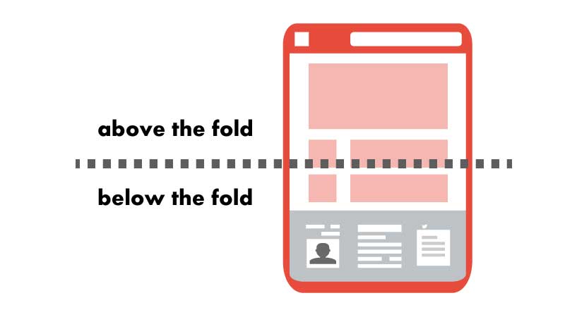
We recommend doing A/B testing to see what placement works best.
Learn more about how to conduct your own A/B testing below.
#2. Make It Personal
A personalized call to action converts 202% better.
Personalized and smart CTAs perform better than basic ones because you are giving your visitors content that reflects their current interests, status, and knowledge on the subject.
Here is what we mean by personal or smart:
#3. Test Buttons Versus Links
Not all CTAs are on top of buttons. In fact, there are certain times when links work better, especially in email marketing.
Remember, links are a form of CTAs when they are telling readers to do something by clicking that link.
Adding images and videos to your emails can reduce deliverability so you may be better off using plain text as the anchor for your actions. Anchor text can increase the conversion rate by 121%.
Again, test this out using A/B testing for your emails.
#4. Use Action-Packed Text
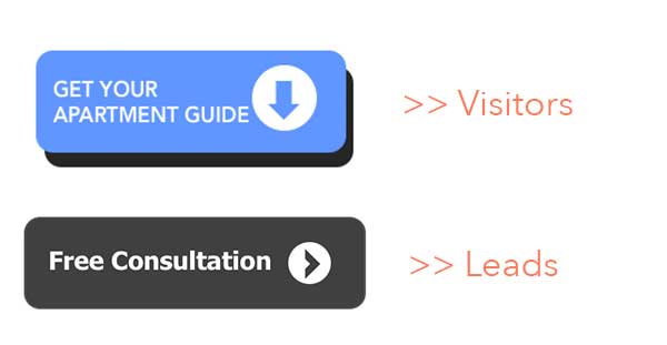
Call to action buttons need to feature action oriented text or else it’s not calling the reader to do anything.
Don’t use boring words, such as “Enter.” Instead, turn to more action-packed words, such as “Reserve” or “Try.”
For events, you can have a text that says “Reserve Your Spot”, “Buy Tickets Now” or “Purchase Tickets.” The point of a CTA is to tell your readers what you want them to do.


#5. Legible Text
The text for your CTA should be large enough to read, but not so large that it is intimating or obnoxious.
It may seem weird that large text makes people nervous but many people experience a subconscious distaste for large lettering, bolding or all caps.
So keep that in mind.
#6. Create a Sense of Urgency
Having a sense of urgency in your call to action buttons can yield better click-through rates.
For example, “Buy Now and Get 10% Off” can lead people to act so they can save money.
Even adding the words “Now” or "Expires" can help create a sense of pressure to buy now.
For more event marketing tips, planning hacks and strategies for boosting your ticket sales, you can subscribe to our blog below.
Thanks for reading!
|
Set up your registration today! Check it off your list, sign up, and start selling tickets.
|