


4 Tips for Creating Effective Nonprofit Donation Pages
Nonprofits are increasingly relying on digital platforms to amplify their major impact and garner support for meaningful causes. At the heart of this virtual engagement is the underestimated and often-overlooked yet pivotal element—the donation page.
An effective donation page serves as the virtual bridge connecting passionate supporters with the power to make a difference. As such, a well-designed donation page can make the crucial difference between a potential donor clicking away or leaving a generous donation amount.
In this article, we'll explore four essential donation page best practices that will help enhance the effectiveness of your online fundraising efforts. Let’s get started!
1. Keep the design clean and clutter-free
A clutter-free design is not just about aesthetics, it directly influences how donors perceive your organization. When visitors land on your online donation page, they should immediately grasp the purpose and easily understand the steps involved in contributing, leading to a smoother online donation experience. So how do you ensure your donation page has a cluster-free and clean design?
Start by avoiding using excessive graphics, animations, or unrelated images that might confuse potential donors and distract from the main goal–making a donation.
Your primary call-to-action (CTA) button should be prominently displayed and easy to find, preferably right below your online donation form. Choose a contrasting color for the button to make it visually distinct. The text on the CTA button should be concise and action-oriented, such as "Donate Now" or "Support Our Cause." This simplicity guides users directly to the desired action without unnecessary detours.
While it's essential to provide relevant information about your cause, explaining why they should donate. Keep the content concise. Long paragraphs or overly detailed information can overwhelm your nonprofit target audience and lead them to abandon the donation process.
In addition, avoid design distractions like sidebars or navigation menus. Besides cluttering your page, they may also lead prospective donors to leave the page prematurely.
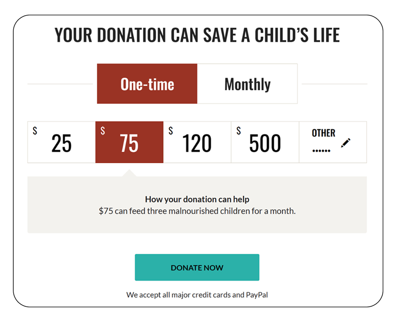
Check out the nonprofit donation page example below.
 Remember to always test your page from the perspective of a first-time visitor to identify and address any potential roadblocks or ambiguities before publishing it.
Also, regularly review and update your donation page to remove any outdated information, campaigns, or expired donation options. This not only keeps the page clutter-free but also ensures that online donors are presented with the most relevant and current information about your initiative.
2. Ensure that the page is responsive
In 2023, mobile devices (excluding tablets) generated 58.33% of global website traffic. This shows why search engines shifted to a mobile-first indexing and ranking strategy. And with that shift, creating mobile-friendly sites became paramount.
Whether it’s eCommerce or SaaS SEO, businesses are creating responsive sites to enhance their performance on search engine results pages. Nonprofit organizations are not exempted from this.
Chances are the majority of your nonprofit website traffic also accesses your page on a mobile device. Therefore, your donation page should be responsive, or else you will be missing out on large donation amounts.
A responsive page design adapts seamlessly to different screen sizes, providing a consistent and user-friendly online donation experience for online donors whether they're using a desktop, tablet, or smartphone. To create a mobile-responsive donation page start with a mobile-first approach, where the layout and functionality are optimized for smaller screens before expanding to larger ones. One key aspect is the use of fluid grids, ensuring that page elements proportionally adjust based on the user's screen size.
This prevents issues such as text or images being cut off or distorted on smaller devices, guaranteeing a visually consistent presentation.
 Additionally, ensure touch-friendly navigation. Most mobile users access websites via touchscreens, so donation buttons and navigation links on your page should be appropriately sized and spaced to accommodate touch interactions. This ensures that users can easily navigate through the donation process on mobile devices.
Testing is key to achieving responsiveness for any website, from a well-designed manufacturer website to eCommerce sites. So regularly test your donation page across a range of devices and browsers to identify any potential issues.
Pay attention to elements like form fields, images, and navigation menus to ensure they function correctly and look appealing on each device. You can use online tools like Comparium or browser DevTools to simulate various screen sizes and resolutions during the testing phase.
3. Craft a compelling and concise headline
Your donation page headline is the gateway to capturing your donor audience's attention and conveying the significance of your cause.
To craft a compelling headline, start by articulating the tangible impact their donations will have in a way that resonates with your audience's values and aspirations. Consider using emotionally charged words that evoke empathy and convey a sense of urgency, emphasizing the positive change donors can effect through their contributions.
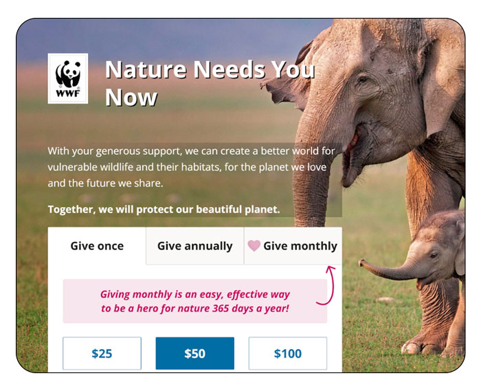
For instance, phrases like "Empower Change Today" or "Be the Difference" show urgency and also instill a sense of purpose, motivating visitors to take action. See how the World Wide Fund for Nature does it below.
 Besides that, naturally integrate keywords in your headline. Doing this will not only enhance the search engine optimization (SEO) value of your page but also signal to interested web users that your page’s content is directly relevant to their query.
Potential donors often scan through content, so aim for clarity and directness. So express the essence of your cause in just a few words, like WWF does in the example above. This brevity not only aids comprehension but also allows the headline to serve as a memorable focal point that encourages users to explore further.
Luckily, today, you don’t have to struggle to come up with a great headline. You can use a generative AI platform and have a couple of great options to choose from in seconds!
How can you know a headline will work best with your donor target audience, and how do you know if another is not the best choice? You can’t, which is why it’s advisable to A/B test your headline choices. A/B testing different headline variations can provide valuable insights into what resonates most with your audience.
Experiment with language, tone, and structure to determine which version elicits the strongest emotional response and prompts the most positive engagement.
4. Provide a variety of payment methods
Offering various payment methods accommodates different donor preferences, making it more likely for individuals to contribute. The more accessible and convenient you make the online giving process, the higher the chances of securing support from a diverse range of donors.
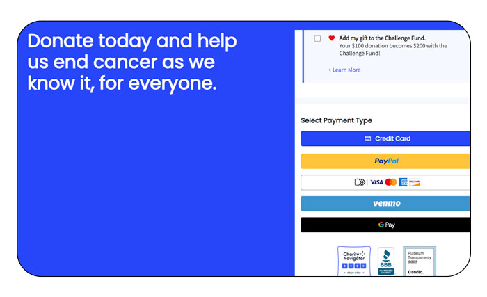 Firstly, incorporating widely used payment methods such as credit and debit cards is essential. These are the most familiar and accessible options for the average donor. Ensure a seamless and secure payment processing system to build trust and confidence, key factors that encourage users to complete their donations.
In addition to traditional card payments, integrating digital wallet options, such as PayPal or Apple Pay, enhances convenience for users who prefer these fast and secure alternatives. Digital wallets allow users to contribute with just a few clicks or taps, which will minimize friction and increase donor conversion rate.
Consider including bank transfers or direct debit options for donors who prefer to contribute directly from their bank accounts. This method may appeal to those who want to make recurring monthly donations or avoid credit card fees.
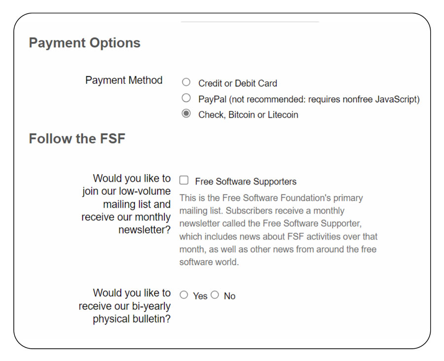
Catering to cryptocurrency enthusiasts is another forward-thinking strategy. It provides an alternative for donors who value the anonymity and decentralization associated with digital currencies. Therefore, consider popular cryptocurrencies like Bitcoin or Ethereum. An organization like the Free Software Foundation is already doing it.
Be transparent about any processing fees associated with different payment methods. Doing this will allow donors to choose a payment gateway that best suits their preferences and budget.
Finally, regularly reassess the popularity of payment methods and adapt accordingly. As trends and technologies evolve, so do donor preferences. So stay informed about emerging payment options and be prepared to integrate them to meet the changing needs and expectations of your audience.
In closing
The success of your nonprofit's fundraising efforts hinges on a well-optimized donation page. To create one that boosts your donation revenue, adhere to the four donation page best practices we’ve discussed above.
They include keeping the design clean and clutter-free, ensuring that the page is responsive, crafting a compelling and concise headline, and providing a variety of payment methods.
By embracing these donation page best practices, you can transform your online fundraising campaigns, forging stronger connections with donors and propelling your missions to new heights. Go ahead and try it today.
 Author: Ian Loew
With decades of experience in B2B web design, Ian Loew is Lform’s Owner, Creative Director, and Head of Business Development, which he founded in 2006. Ian has worked with a diverse range of clients, including small startups and large corporations. He takes great pride in truly understanding and translating what clients want into actionable results.