


7 Tips for Building Landing Pages that Convert to Ticket Sales
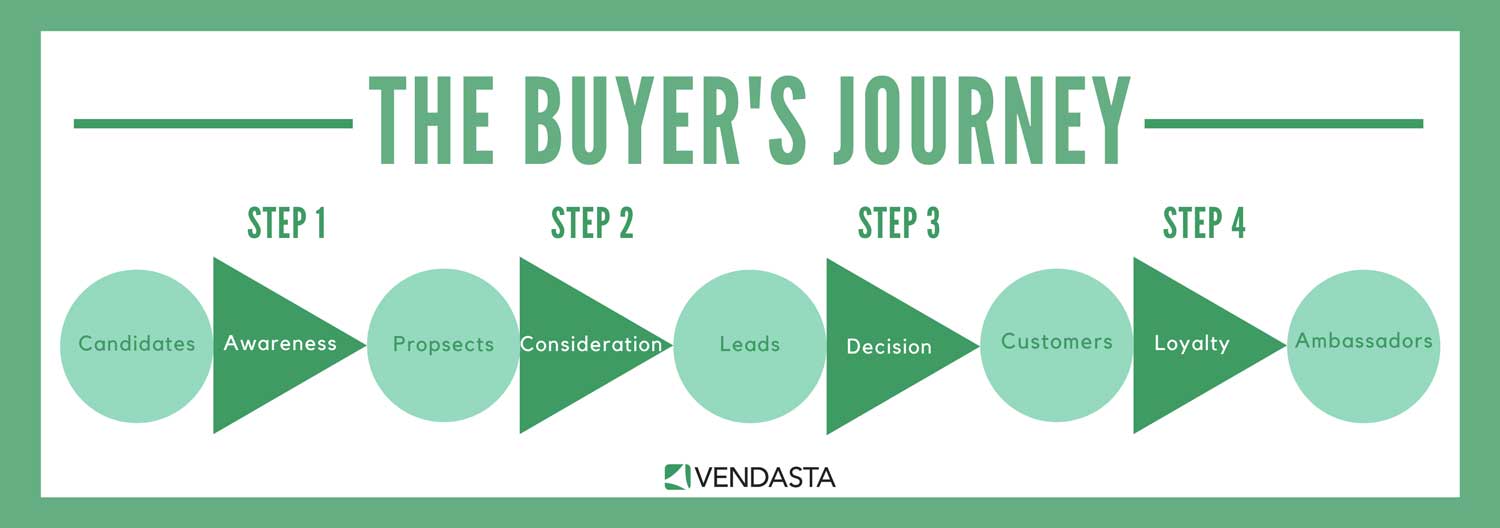
Before you formulate your ticket registration landing page, it’s a good idea to sit and also think about the journey someone who registers for your event might take.
Typically, someone will start by visiting your website/landing page, reading your content, leading them to click on a page dedicated to signing up potential attendees for an event.
In this article, I’ll be covering some event marketing ideas to help you build an effective landing page to encourage potential attendees to sign up for your event.
Landing pages are a crucial part of the buyer's journey process.
1. Messaging is key
Although it may appear we live in a time where the written word is being trumped by Instagram posts and Snapchat filters, it’s still absolutely vital that the messaging for your online audience is absolutely spot on.
In fact, well over half of businesses use content to raise brand awareness.
It’s even more crucial when you’re trying to target a relevant audience. The people within this audience are trying to figure out whether they should spend their time and money on attending your event, and your landing pages and any relevant blog posts, need to convince them it is worth it.
2. Emphasis
For making your website and putting together an event landing page, simplicity is the key. Be sure to focus your content and page design to ensure you’re only emphasizing the key points. Sure, it can still be branded and beautifully designed, but it must not distract from the intention of encouraging sign-ups.
Keeping everything short and to the point helps to keep the visitor’s attention. The only action they should be able to take on the page is to submit a form. This should be clear from the moment the page loads.
Tips for building effective landers:
- Always determine your goal before creating the page (CTA click, filling out a form, etc.)
- Put your CTAs throughout the landing page (top, middle, bottom, throughout content)
- Keep it simple, don't over crowd
- Avoid crazy font, too much bold, bright colors, etc. Keep it on brand and keep it simple.
- Make sure your message is clear above the fold. Viewers should know what the landing page is advertising for right away
- Don't include any redirects, that would bring customers away from completing the end goal. For example, a link to read more on the blog, when the goal is to request a demo.
3. Remove obstacles
Any high-performing ticket registration landing page aims to limit the number of obstacles that a potential attendee must deal with.
1. Long forms with unnecessary fields will seriously hinder your ability to attract attendees.
2. Be sure to restrict the number of questions to ensure you’re getting only the minimum amount of information you require. Recent statistics show that the second most common reason for someone to abandon a form of submission is due to length.
3. By keeping the required information to a minimum, you’re far more likely to get the user to complete and submit the form.
4. Create urgency
If you’re running a special ticket price on a first-come, first-served basis, a competition, or anything of that nature, then you need to let your audience know about it, and fast!
Integrate a countdown timer, so your potential attendees know precisely when these offers expire. By creating a sense of urgency, your prospects will understand that they must act now or risk missing out on your special offers, and the longer it takes to convince them to register, the more likely they will be to pass on the event altogether.
The fear of missing out is a powerful motivator, so it doesn’t hurt to light a fire under them to persuade them to act fast. 
5. Understand your audience
We covered this on a surface level in tip one, but it’s something that needs a more in-depth look.
When writing up your landing page, it’s crucial that you have a good understanding of whom you’re aiming to target for your event. Once you understand who your audience is, it’s much easier to connect with them.
One of the best ways of inspiring your audience’s action is to empathize with your reader about a specific pain point they might experience. Then you can stress that your event may just be the perfect way to relieve that problem.
It’s also best to write in the second person, so you’re addressing your reader directly; not only is it more personal, but it’s more engaging too.
6. Inspire action
Once visitors land on your page, it’s essential to let them know precisely what you need them to do; otherwise, they may not register, even if they feel the event is right for them. Therefore it’s important to produce a copy in an action-oriented tone with a clear call to action, such as buttons with phrases like “Click Here to Register Today.”
That way, readers are completely clear on what they need to do to register.
A valuable acid-test for this is to ask someone who hasn’t worked on the copy to look at the page for no longer than 5 to 10 seconds.
Is it clear to them precisely what is required of them?
Are they clued up on what benefits your event will offer them?
7. Transparency
If your page is muddled and confusing, it doesn’t matter how many calls to action you add to the page. Your content must be conveyed in its most simple form so that even someone who is only scanning the page can understand what it is you’re offering and what you need from them.
Again, a good barometer for this is to ask someone who is completely unaware of what your event is to look at the page. Then ask yourself, “does their feedback correlate with what I am trying to communicate?”
Takeaways
Even with the difficulties we’ve experienced in the industry in 2020, one of the best ways to encourage more attendees to your events is to build better landing pages. This way, you can convert a good deal of your existing audience without having to drive thousands of brand new visitors.
The best ways to do that is to:
-
Create relevant, action-oriented, and transparent copy.
-
Design a page that looks great and is still simple to navigate.
-
Remove the roadblocks that might prevent potential sign-ups.
Of course, for these solutions to work effectively, it’s good to spend some time A/B testing and gathering feedback from impartial sources.
Author: Ricky Wang
Ricky Wang is the founder of RickyWang.com where he provides online guides and resources to help to aspire entrepreneurs build and grow profitable online businesses. Connect with him on Twitter and LinkedIn.